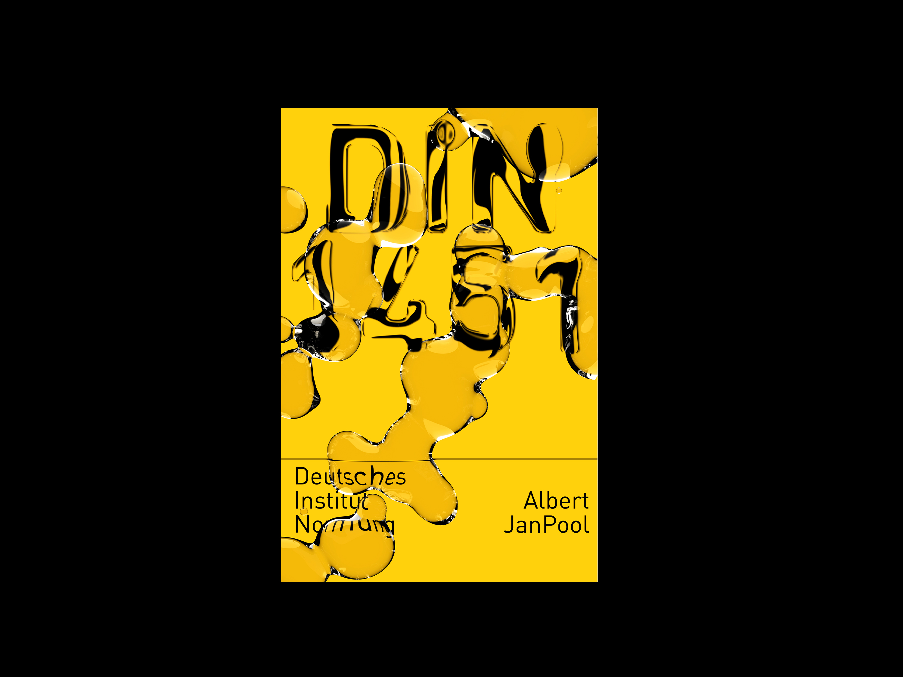
DIN Type specimen ( 2021 )
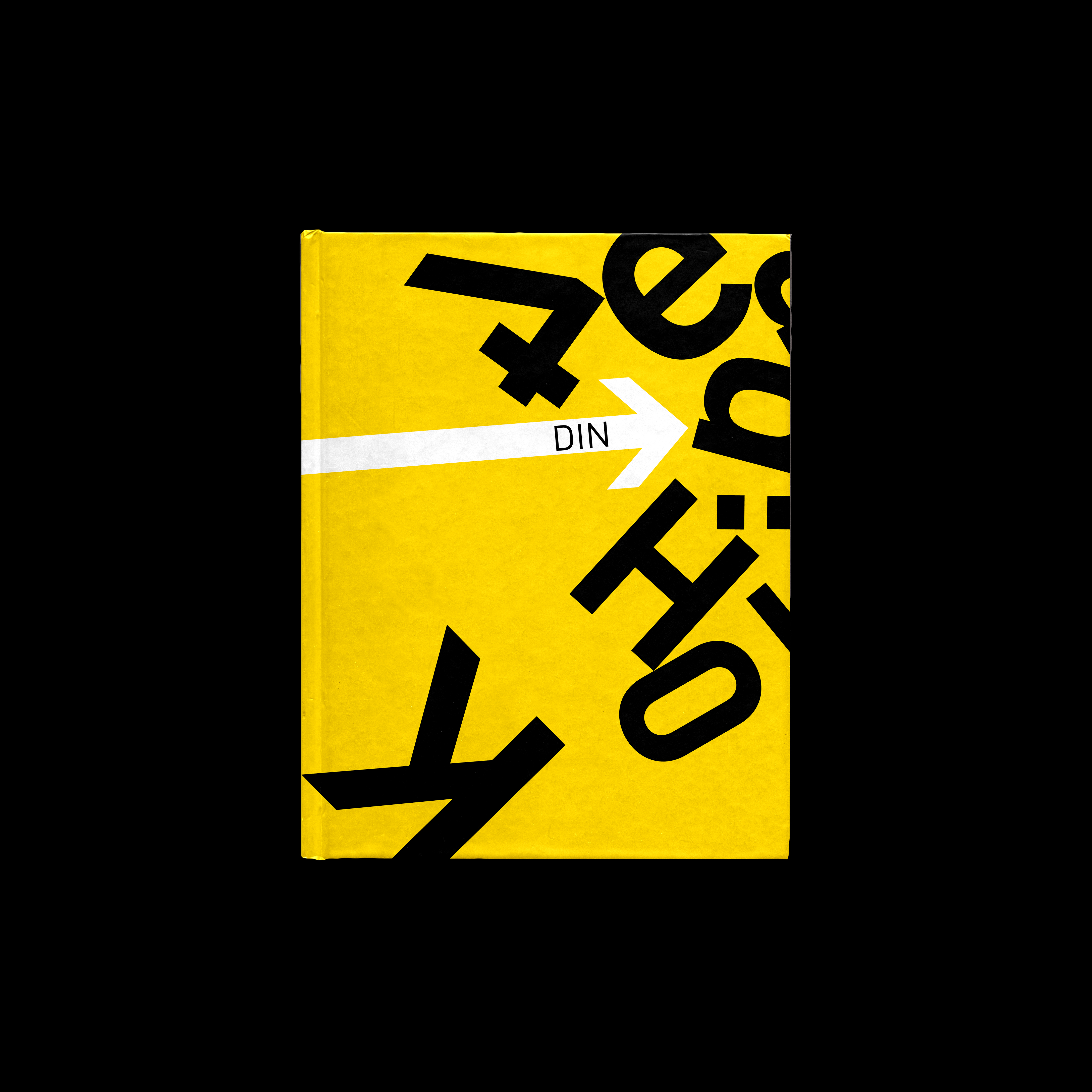
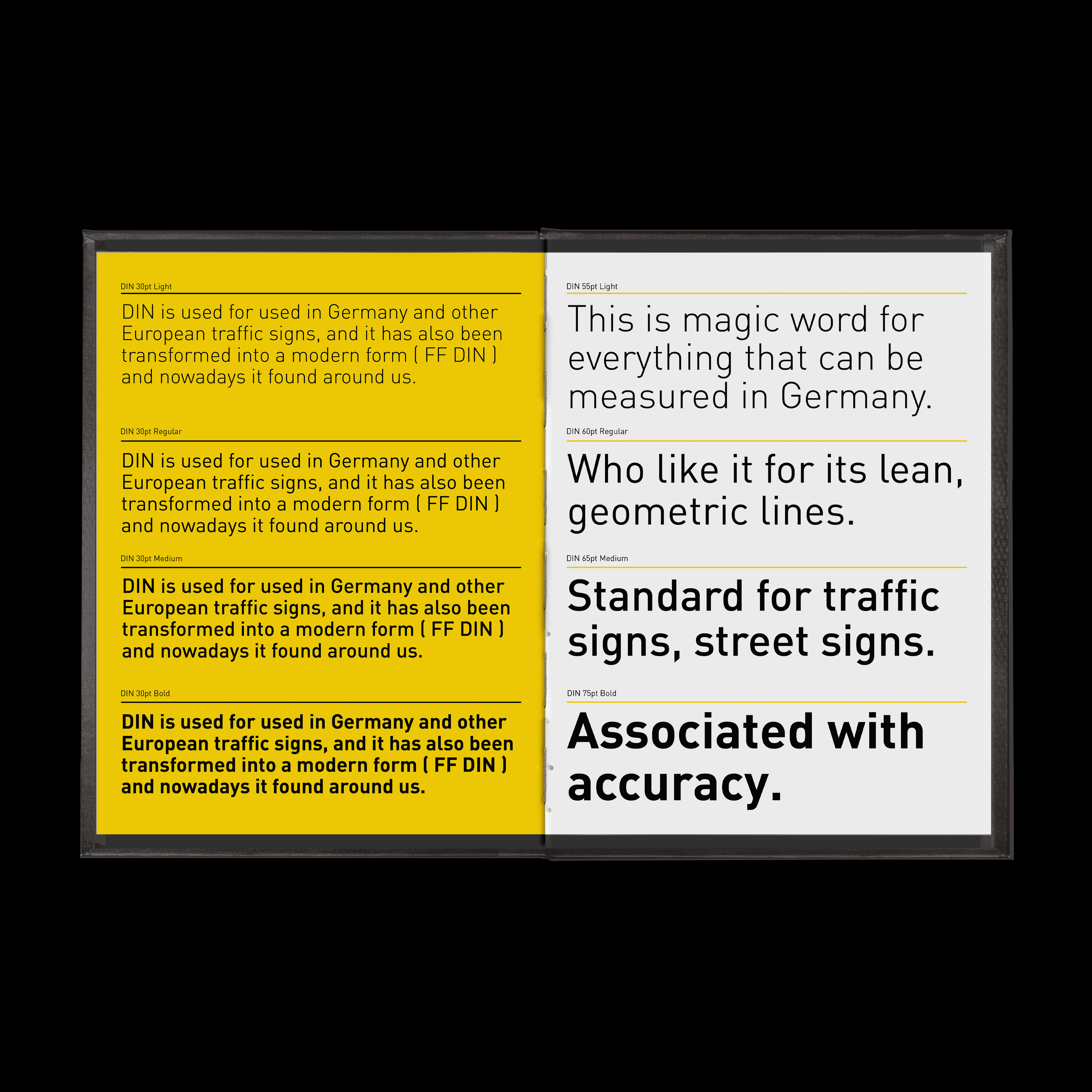
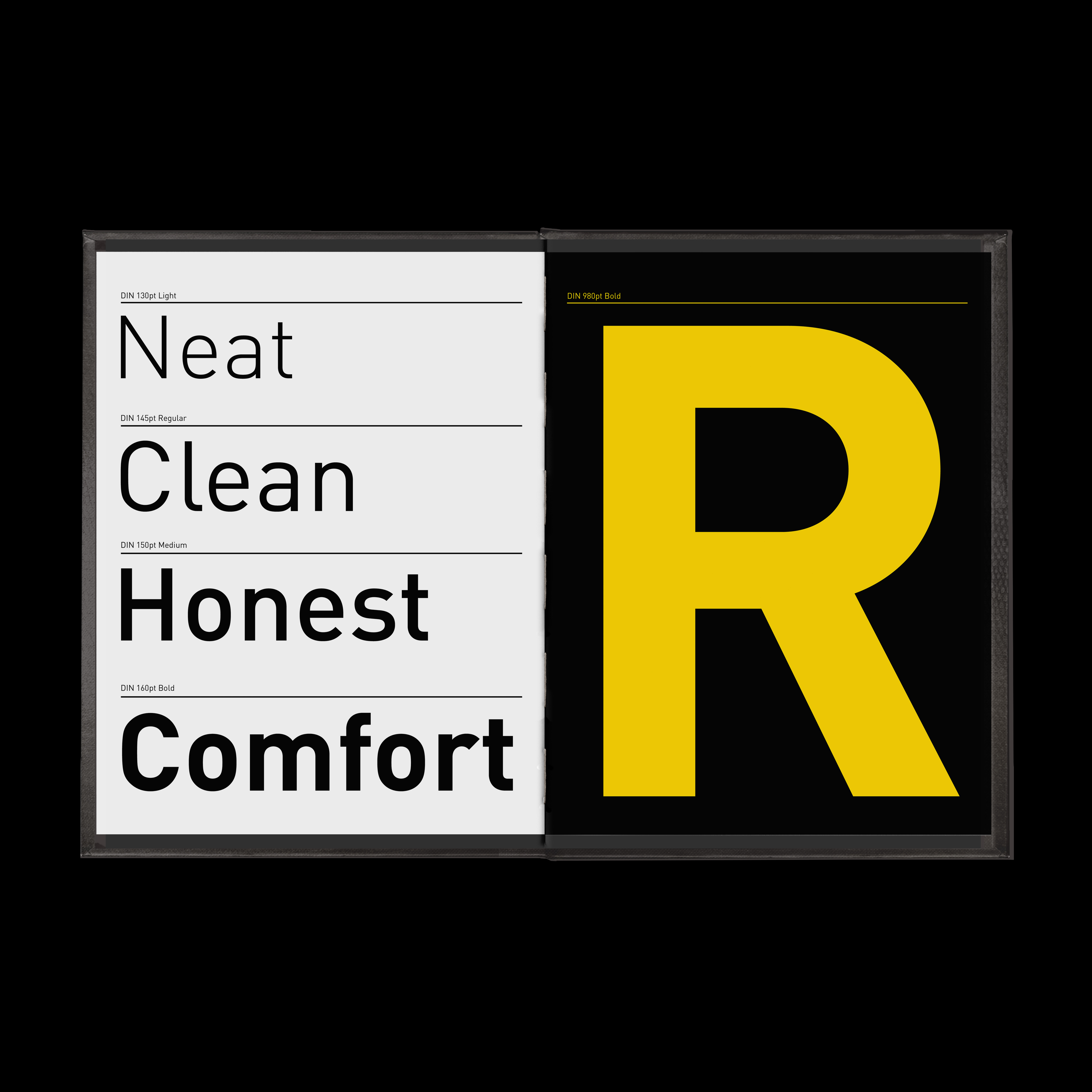
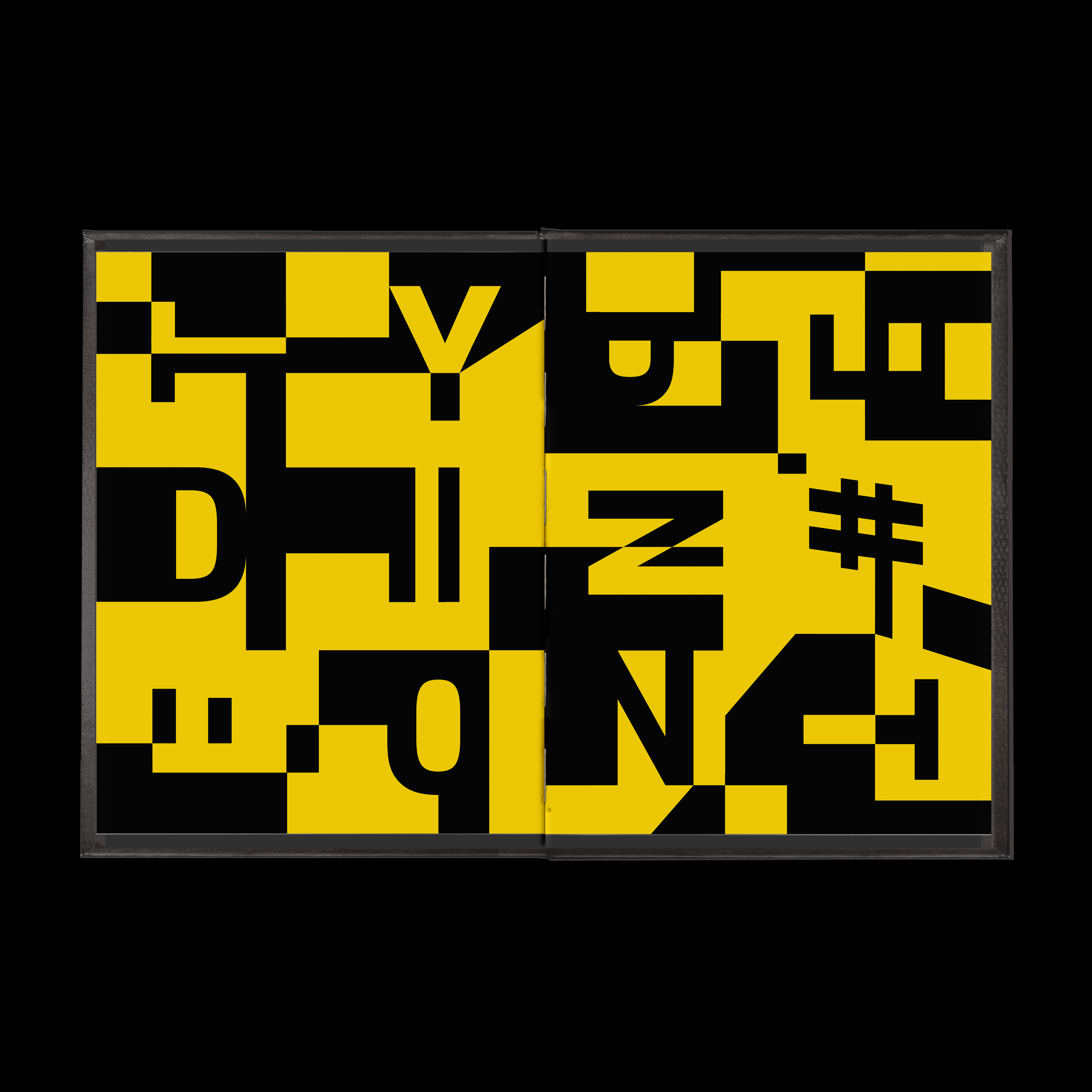
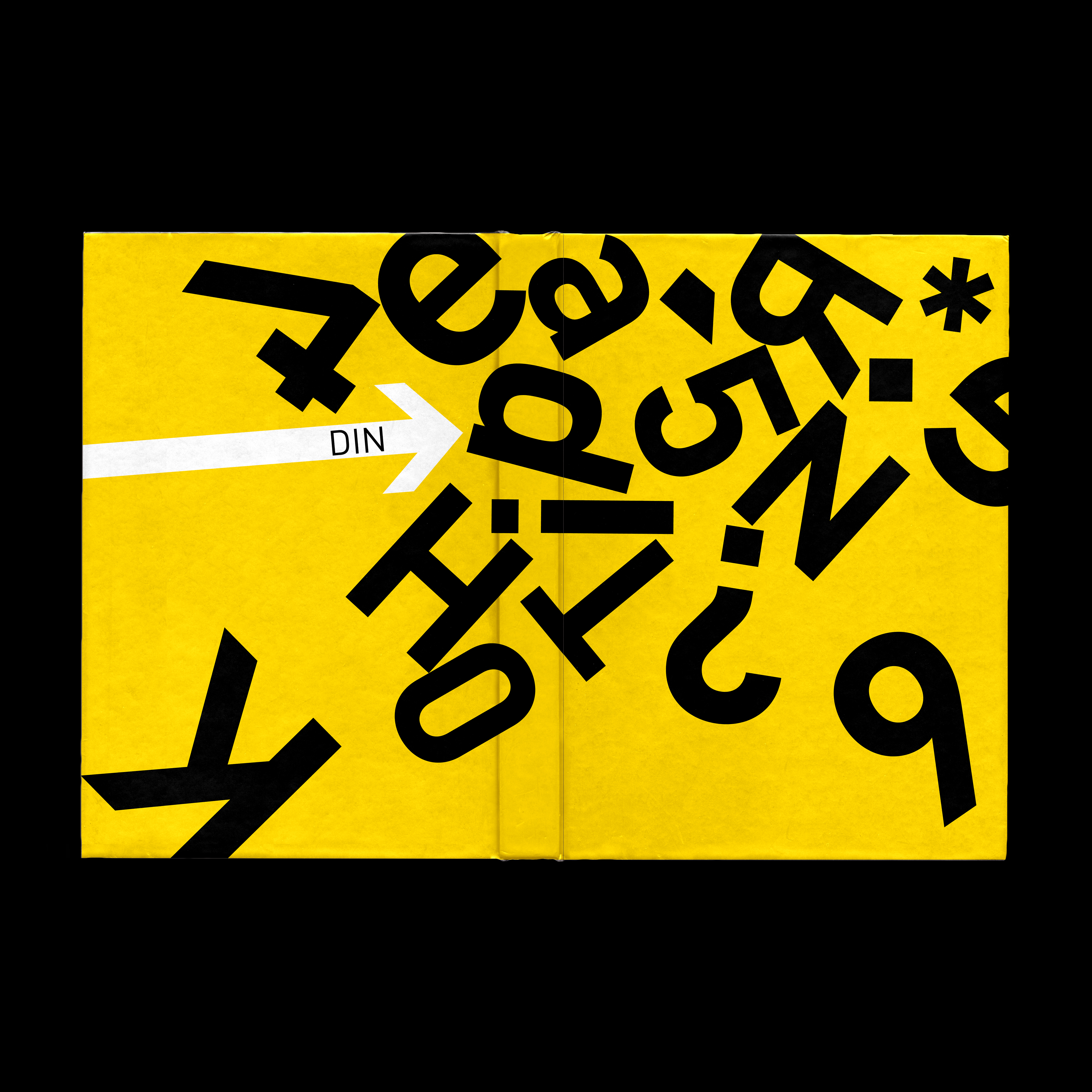
‘DIN’ is a sans-serif typeface that is widely used for traffic, administrative and technical applications. Similar standards existed for stenciled letters. Originally designed for industrial uses, the first DIN-type fonts were a simplified design that could be applied with limited technical difficulty. Due to the design’s legibility and uncomplicated, unadorned design, it has become popular for general purpose use in signage and display adaptations. Many adaptations and expansions of the original design have been released digitally. I chose the traffic sign concept, which I think is the most represent image of din font’s use. Among the traffic signs, I was inspired by the arrow signs, so I used strong contrast yellow and black as the main colors of this specimen.